ZEISS Meditec · 2022–2023 · Contractor · UX lead
Clarity as a clinical requirement
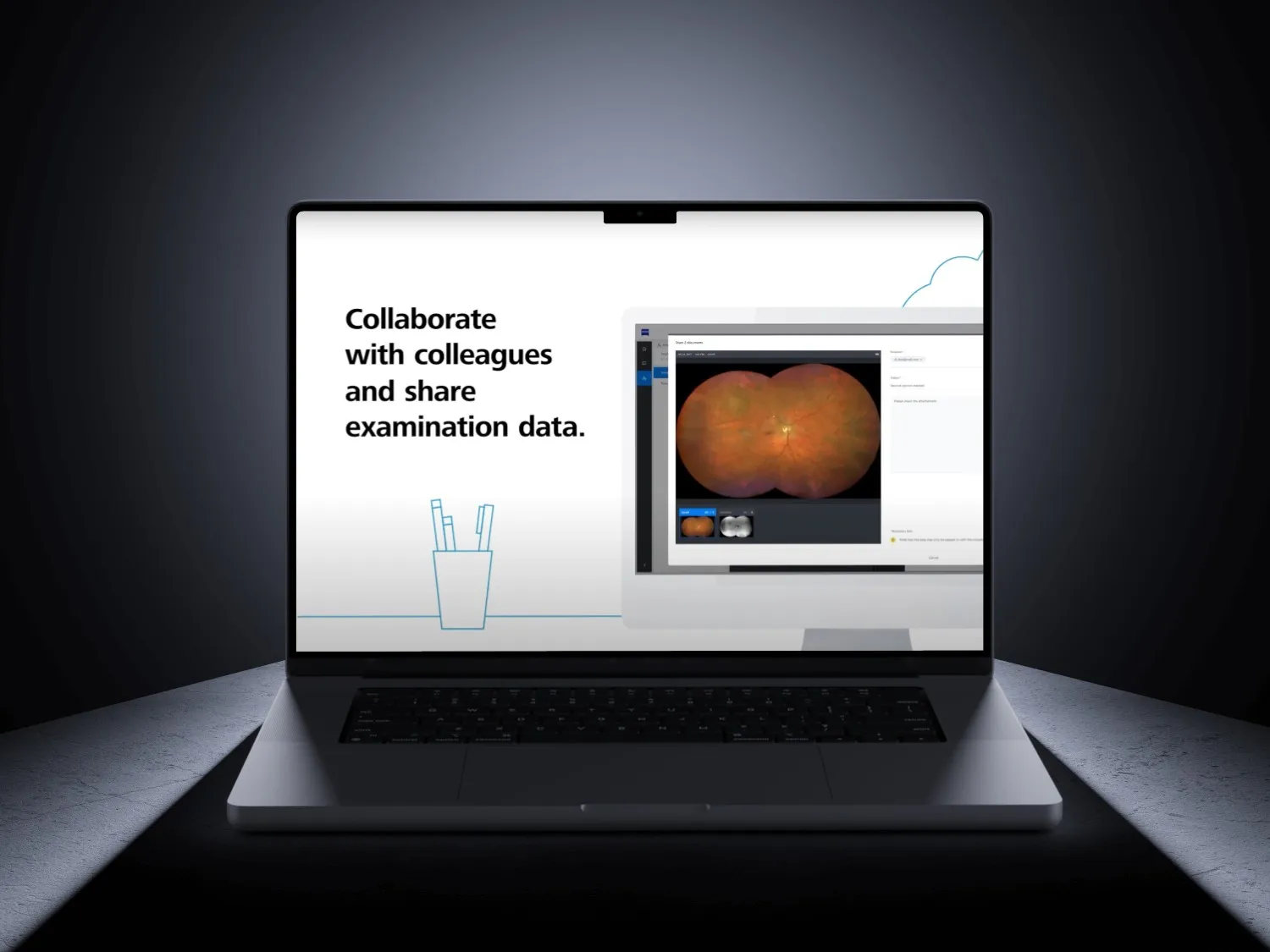
ZEISS Surgical Cloud, a platform handling the data around surgery, taken from prototype through usability testing to design-system-ready UI.
- Role
- Concept, research, usability testing, UI design
- Client
- ZEISS Meditec
- Years
- 2022–2023
The Challenge
ZEISS Surgical Cloud handles the data around surgery: devices, cases, users and the permissions that connect them. In a clinical setting an ambiguous interface is not a usability complaint, it is a safety issue.
Clinical staff needed to manage devices, cases and access without any state ever being ambiguous. What usability testing repeatedly surfaced was that users were not confused by complexity. They were confused by reversibility: whether an action had already happened, and whether it could be undone.
The work ran lean inside an agile team, which meant design decisions had to survive contact with a sprint rather than a review deck.
Key Decisions
- 01
Settled disagreements by testing rather than arguing
- Considered
- Resolving contested flows in stakeholder review, which is faster and costs nothing.
- Chose
- Putting the disputed flow in front of real clinical users and letting the result decide.
Usability testing was not a validation step bolted onto the end. It was the mechanism for resolving internal disagreement, which is a far better use of it.
- 02
Stated system state instead of implying it
- Considered
- Optimistic UI, which shows the intended result immediately and reconciles later. It feels faster and is the modern default.
- Chose
- Showing what is actually true, including a visible pending state while it is still pending.
Optimistic UI has no place where the user needs to know what has genuinely happened. If something is pending, it says pending.
- 03
Made destructive actions name the object and the consequence
- Considered
- A standard “are you sure?” confirmation dialog.
- Chose
- A confirmation naming the specific object and the specific consequence of continuing.
A generic confirmation trains people to click through it. A confirmation that names what is about to happen is the only kind that gets read.
- 04
Designed into the existing design system rather than beside it
- Considered
- Designing freely and reconciling with the design system afterwards.
- Chose
- Using what Storybook already provided, and contributing back the components it lacked.
Every component either used what the system already had or was given back to it. Design that ignores the system produces a second system.
The Solution
Concepts developed and prototyped, user research planned and run, usability tests conducted, and UI designed within the existing design system.
Delivered as concept documentation, tested prototypes, and contributions back into the ZEISS design system.
The Results
Prototypes were tested with real clinical users, and the patterns that came out of those sessions fed back into the ZEISS design system rather than staying inside this one project.